Landing page lite
The creative teams I’ve managed have always wished for the same thing: More time. To ideate, learn, explore, experiment. As part of Sprint’s Digital Transformation, I led a team that took the time-consuming process for creating landing pages down to the studs and rebuilt it for speed, velocity, consistency and stability. In the end, my team got more time to play — and a whole new playground.

STEP 1: ASSESSMENT
We took a deep dive into 6 months of work — hundreds of projects. We tallied up time spent on each task, from concepting, to getting approvals and carving up images. Among our eye-openers: We spent more time on throw-away assets (mockups, red lines for dev, decks for execs) and corrective action (like back-and-forth QA with dev) than we did on ideation or final deliverables. Plus, the end-results were often one-offs; uniquely created for each ask.
STEP 2: APPROACH
We started with what we — the creative team — could change or improve ourselves. We amped up our style guide, debated & decided on common visual components and interactions, and introduced a more collaborative writer-designer working model. Then we expanded the circle to streamline other time sucks like feedback loops, approvals, coding & QA.
STEP 3: TOOLS
We could not have truly transformed without a triad of innovative tools – Sketch, InVision and Adobe Experience Manager. We knew from our assessment what the pain points were, and what we could save by streamlining. That data built a solid business case for investing in software that revolutionized how we concepted, collaborated and built pages.
Our transformation toolboxSTEP 4: EXECUTION
With new tools in hand and training complete, our first true test was a complex set of product landing pages that typically took 8+ people (including creative, development & analytics) more than 200 hours to launch, end-to-end. We got the job done with 3 people in less than 40 hours.
Our new toolbox
SKETCH
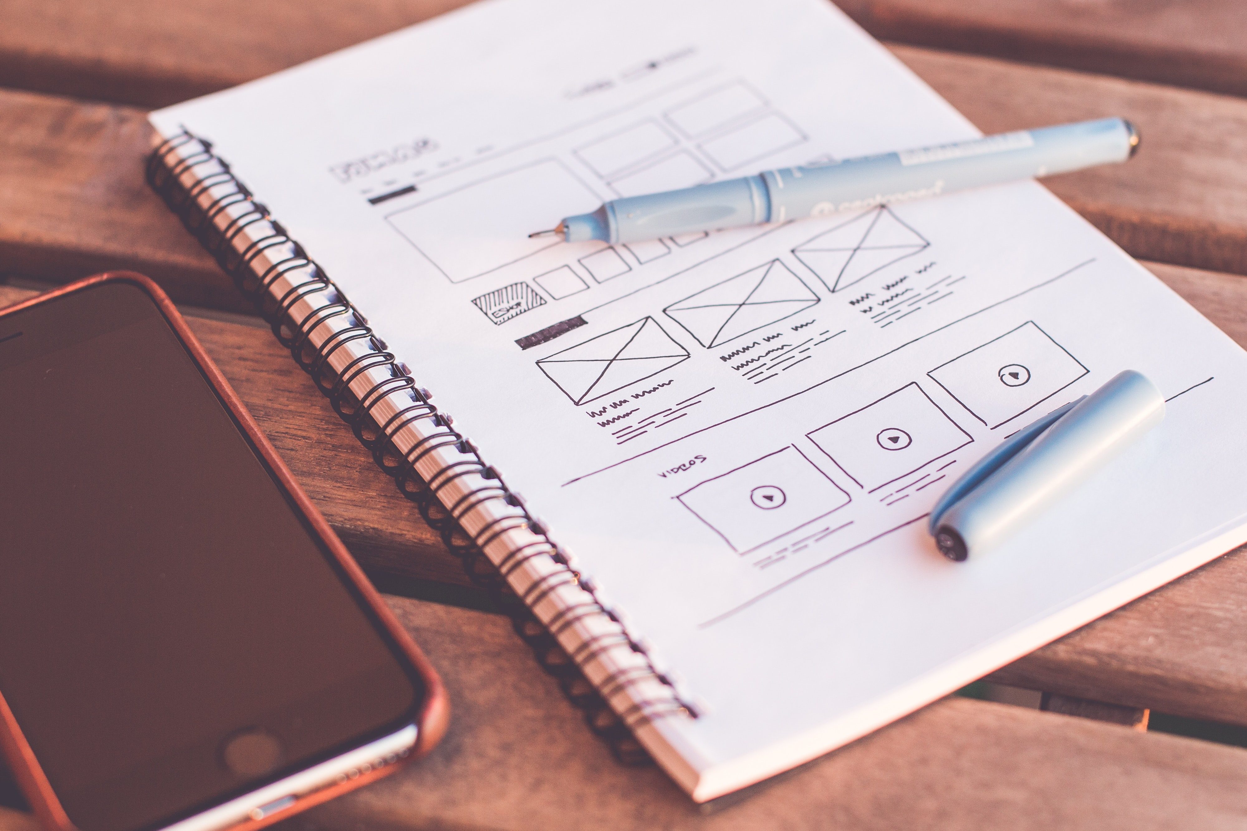
We used Sketch to make element and pattern libraries, wireframe the IA of a page, build mockups and give the dev team easy measurement annotations. Sketch housed our living style guide and — prior to us doing so in Adobe Experience Manager — let writers and designers collaborate in a single file.
INVISION
InVision was our workhorse for clickable prototypes and fast & easy feedback. Gone were massive PowerPoints, long calls describing interactions, back-and-forth emails with questions and comments. Legal, brand, dev — anyone who needed to give their 2 cents — simply clicked and added a note.
ADOBE EXPERIENCE MANAGER
Adobe Experience Manager made it all real — literally. We could drag-and-drop a production-ready page (incuding analytics) in a few hours — or less. With the push of a button, we were live. In our new post-transformation world, developers spent time building and enhancing components and left the page-building and publishing to us.
The results
(for a typical landing page)